
Why they came to us
Safer Walking came to us because of the website we built for Land Search and Rescue New Zealand. They had seen that work up close, liked what it did, and wanted the same thinking applied to their own site. That kind of referral is the best brief you can get: they already knew how we work and what we deliver.
Their site needed a refresh. The content was solid, but the presentation was tired and the whole thing needed to feel more appealing to the people it was there to help.
A site with a lot of stakeholders
Safer Walking is not run by one organisation. Several organisations are involved in managing it, and each has a stake in what the site says and how it says it. That made this a sensitive project, and it shaped how we worked from the first conversation.
We worked carefully with every party involved. Changes were shared, feedback was gathered, and nothing went live without the right people being comfortable with it. Slower in places, yes, but that care is what keeps a multi-organisation project on track.
Built to be genuinely accessible
The brief carried an unusually strict accessibility requirement, and it was a core part of the project from day one, not something bolted on at the end. The site had to be genuinely screen-reader ready and meet accessibility guidelines closely.
We built with that in mind throughout: structure, headings, navigation, imagery, all checked against what a screen reader would actually do with them. For a safety initiative, accessibility is part of the job. If someone cannot use the site, the site has failed them.
The result
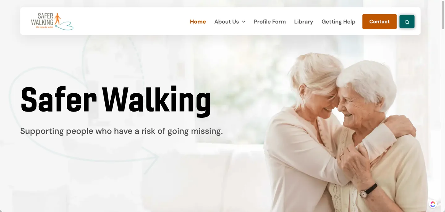
The refreshed site is cleaner, clearer and far more appealing. Importantly, we did not throw out what Safer Walking already had. We took their existing content and improved it, keeping the knowledge while lifting the presentation.
The outcome showed up where it matters: a significant increase in visits, visible in their analytics. More people finding the site means more people getting the safety information it exists to share.